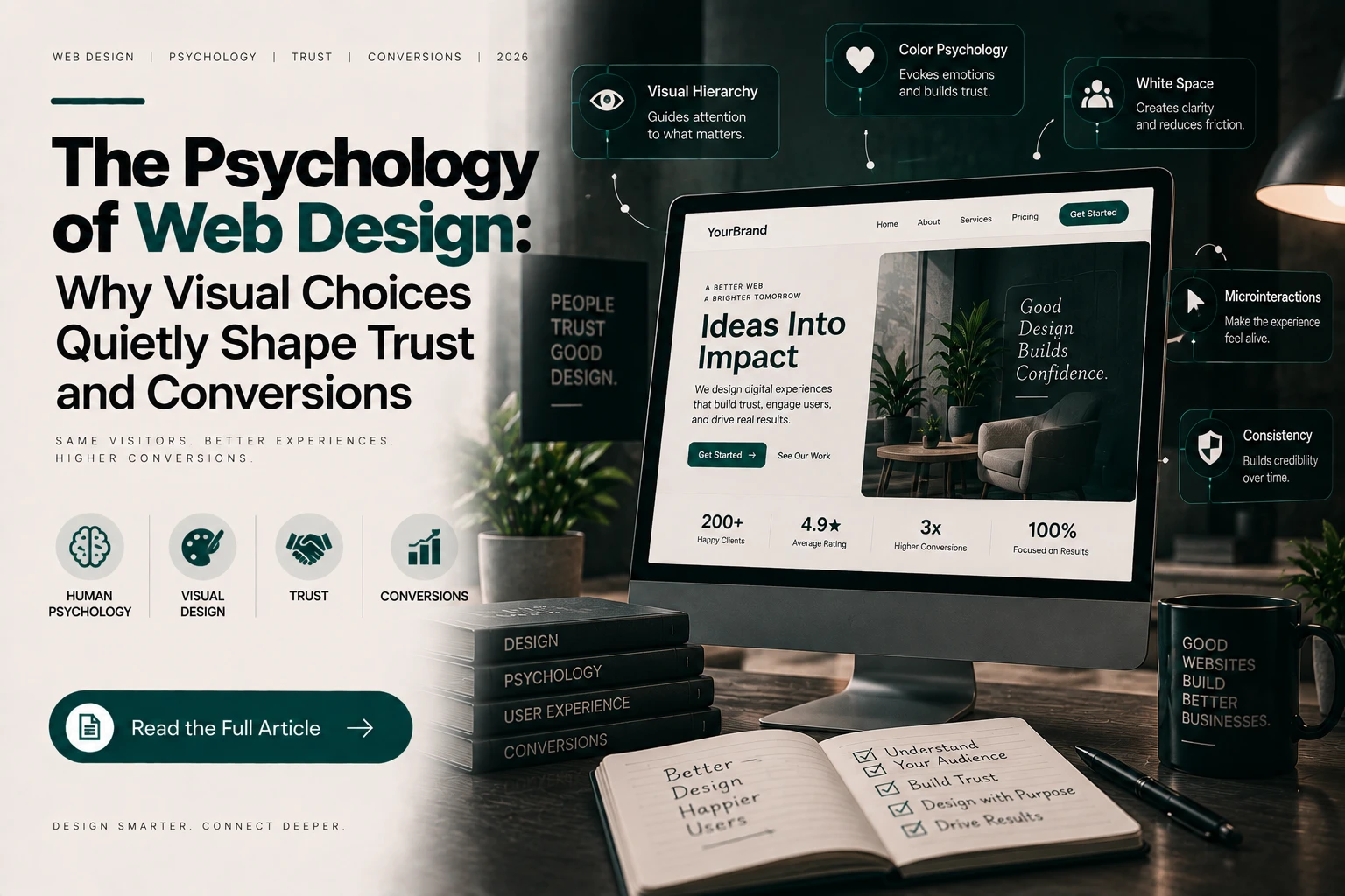
Research from Stanford’s Web Credibility Project found that the overwhelming majority of people judge a website’s credibility based primarily on its visual design — not its actual content, business credentials, or the accuracy of what it says. This is an uncomfortable finding for anyone who’s poured effort into writing good copy or building a genuinely reliable business, only to lose a visitor’s trust in the first few seconds because of how the page looked. Here’s what’s actually happening psychologically, and what it means practically.
First Impressions Form Before Conscious Evaluation Begins
Research on visual perception has repeatedly found that people form an aesthetic judgment of a webpage within a fraction of a second — long before they’ve consciously read anything or evaluated the actual substance of what’s being offered. This initial, largely unconscious impression then colors how the rest of the page is perceived; a strong first impression makes visitors more forgiving of minor imperfections elsewhere, while a weak one makes them more critical of everything that follows, even if the underlying content is genuinely strong.
Visual Hierarchy Guides Attention Whether You Design It Deliberately or Not
Every webpage has a visual hierarchy — the order in which a visitor’s eye is drawn to different elements — whether or not that hierarchy was designed intentionally. Size, contrast, whitespace, and positioning all signal importance, and visitors instinctively read these signals to figure out what matters most on a page within seconds. A page without a clear, deliberate hierarchy forces visitors to work harder to figure out what to look at and do next — and that friction, even when subtle, measurably reduces the likelihood they’ll take the action a business actually wants them to take.
Color Carries Meaning, But Context Matters More Than Universal Rules
Color psychology gets discussed constantly in design circles, often reduced to oversimplified rules (“blue means trust,” “red means urgency”). The reality is more nuanced — color associations are real but heavily shaped by cultural context, industry expectations, and how a color is used relative to the rest of a page, not fixed universal meanings. What matters more consistently than any specific color choice is contrast and consistency: sufficient contrast for readability and accessibility, and a consistent, deliberate palette that reinforces a coherent sense of brand and professionalism throughout a visit, rather than feeling visually disjointed page to page.
Clutter Reads as a Trust Signal, Not Just an Aesthetic Preference
A cluttered, visually busy page doesn’t just look less polished — it genuinely reads to visitors as a proxy for how carefully a business operates more broadly. Excessive competing calls to action, inconsistent spacing, and visual noise create a subtle but real impression of disorganization that transfers, often unconsciously, to how a visitor judges the underlying business itself. This is part of why genuinely thoughtful, well-executed design work — the kind that carefully considers hierarchy, spacing, and restraint rather than cramming in every possible feature — tends to outperform busier, more feature-dense designs on trust and conversion metrics, even when the busier page technically offers more information.
Consistency Builds Trust Cumulatively, Across an Entire Visit
Trust in web design isn’t built by a single strong homepage moment — it compounds, or erodes, across every page a visitor encounters during a session. A polished homepage followed by an inconsistent, poorly designed internal page or checkout flow undermines the trust the homepage worked to establish. This is exactly why design quality needs to be considered holistically across an entire website, not treated as a single hero-page project — the weakest page a visitor encounters often has an outsized effect on their overall impression, regardless of how strong the rest of the site is.
What This Means Practically
Invest design effort proportionally to where visitors actually make decisions, not just the homepage — product pages, contact forms, and checkout flows deserve the same design care as the page a visitor lands on first.
Prioritize clarity and restraint over visual density. A page that does fewer things clearly tends to outperform one that tries to communicate everything at once.
Treat visual consistency as a trust mechanic, not just a branding preference — inconsistency between pages does measurable damage to credibility, beyond simply looking less cohesive.
FAQs
Does good design really affect sales, or is it just aesthetics? The research is fairly consistent here — design quality directly affects perceived credibility, and credibility directly affects whether visitors take action, meaning design has a measurable, not just aesthetic, effect on business outcomes.
Is there a “correct” color scheme that builds the most trust? No single universal answer — what matters more consistently than any specific color choice is sufficient contrast, accessibility, and a coherent, consistently applied palette throughout the site.
How quickly do visitors actually judge a website? Research indicates an initial aesthetic impression forms within a fraction of a second, well before a visitor has consciously evaluated any actual content on the page.
The businesses that treat design as a genuine trust mechanism — not just a visual finishing touch — tend to see it reflected directly in how visitors respond, often before a single word of copy has been read.






chat_bubble_outline Leave a Reply